
DS Creative - Branding
Eagle Landing Branding
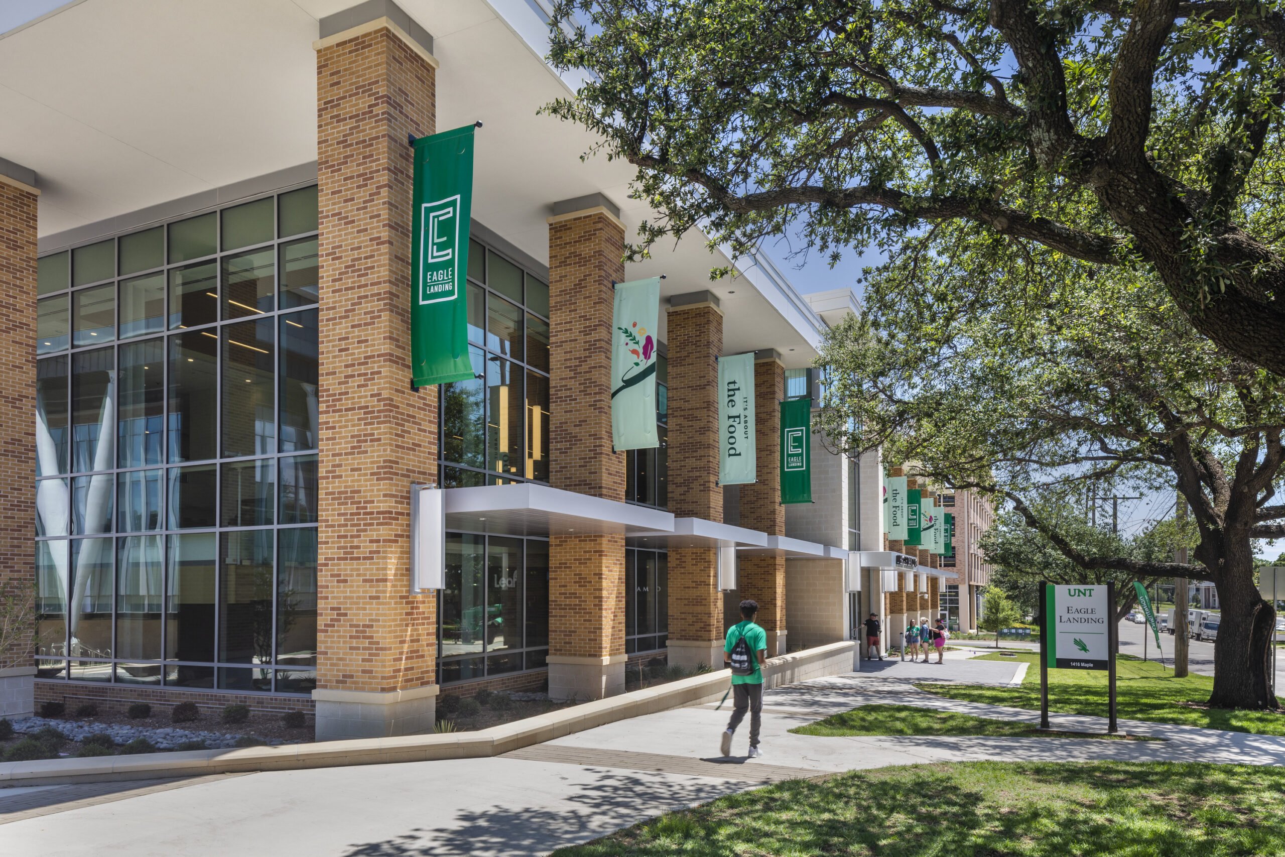
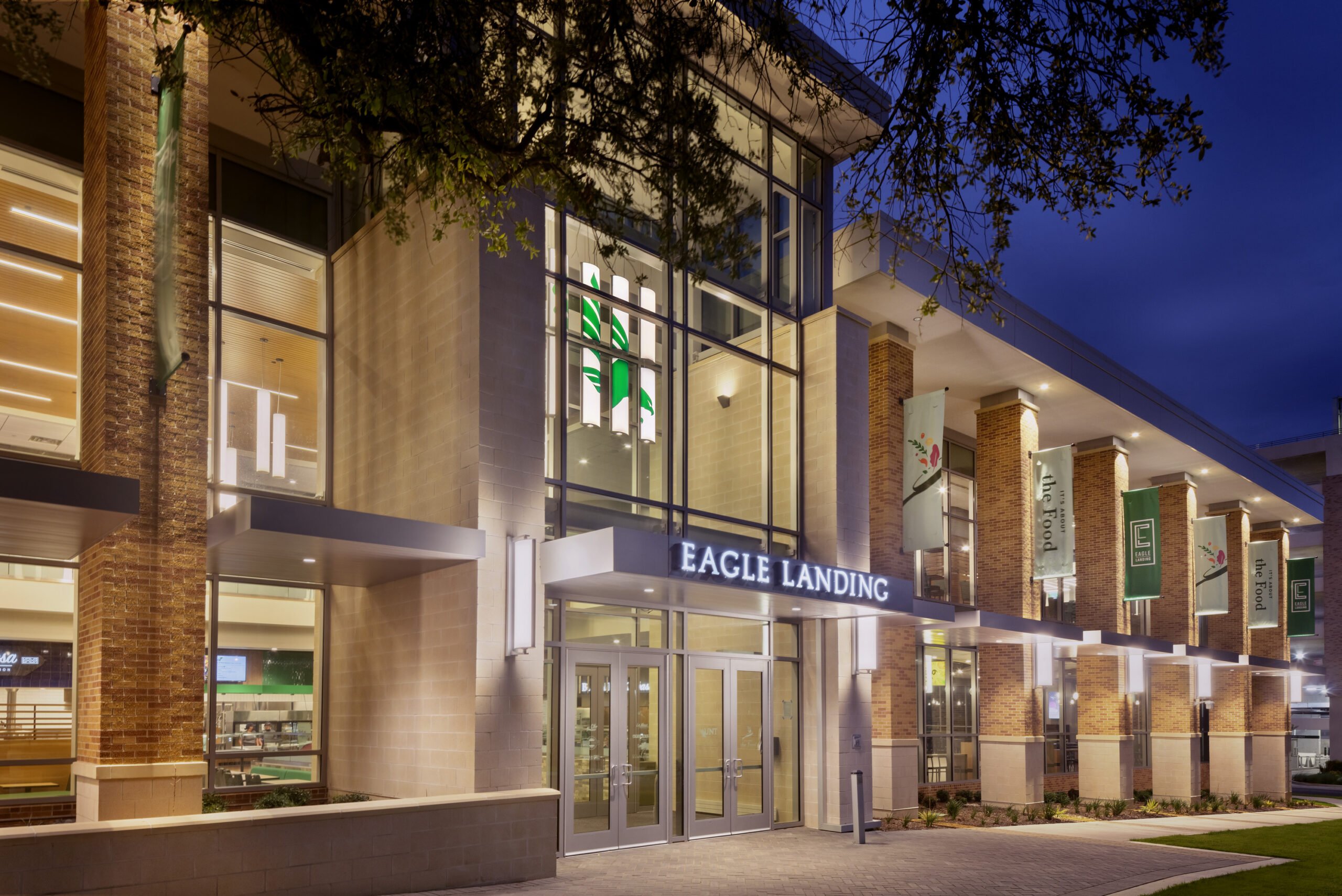
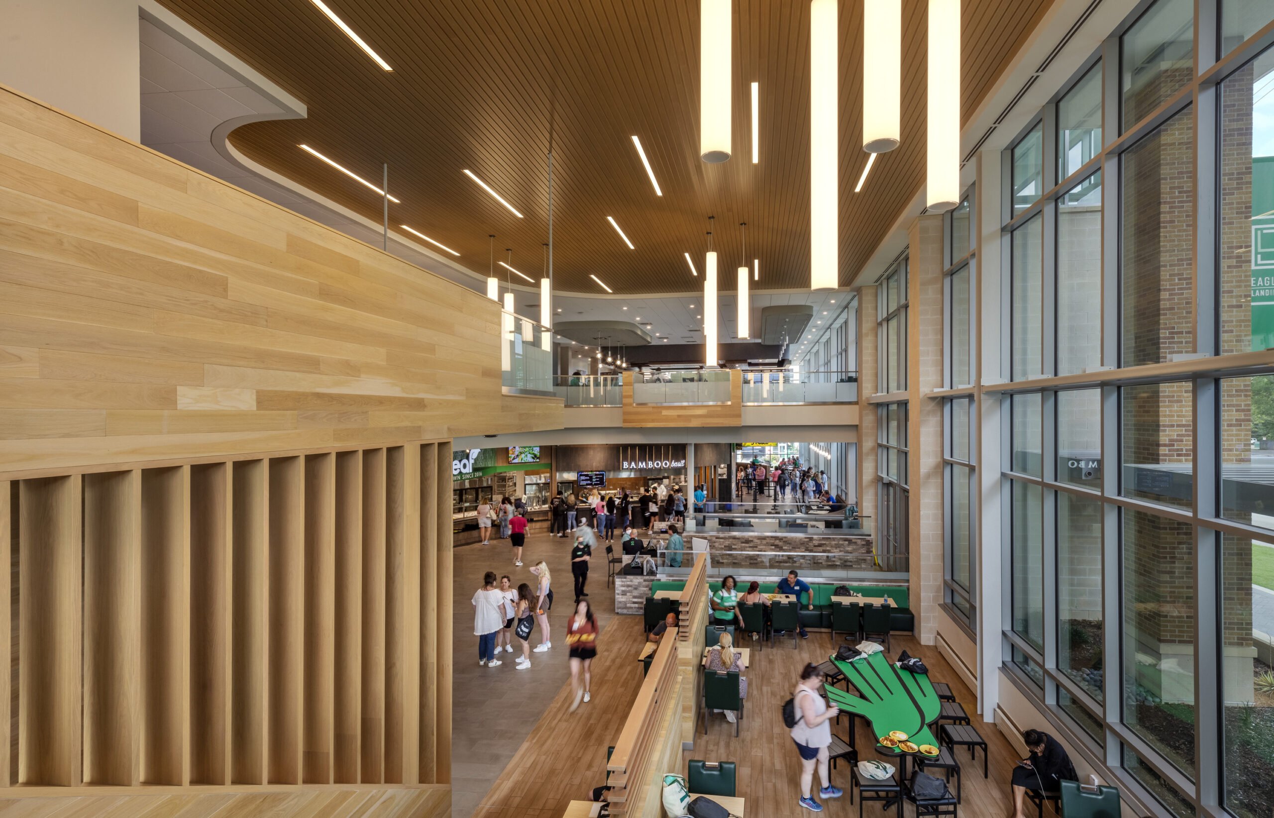
After the Eagle Landing construction project started, we knew this Dining Hall was going to be phenomenal. And as such, it needed phenomenal branding. We took our time developing the logo and ended with this simple and elegant mark. It’s a vertical mark, hinting at the two-story building, and the “E” itself resembles a ground floor, second floor and roof. The facility is state-of-the-art yet has a simple, elevated look to it. Tucking the “L” into the “E” on the logo resembles that fact—that there’s more than might first meet your eye.